Circle graphs quiz
Circle graphs, data & fractions math quiz online for kids.
Math quiz online on proportions of circle graphs
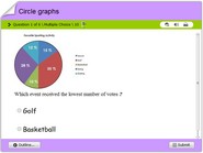
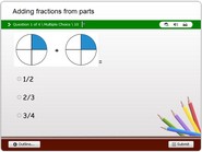
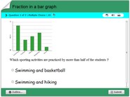
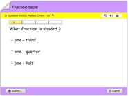
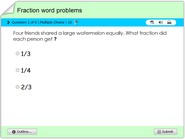
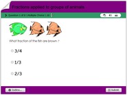
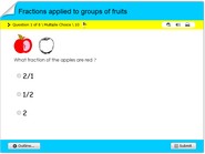
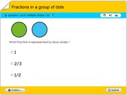
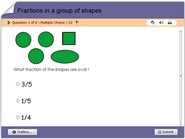
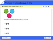
Math quiz online on proportions of circle graphs. In this math quiz, children will understand how data is represented on circle graphs also referred to as pie charts. These graphs have several fraction proportions represented with varying colors. Each problem contains a multiple choice answer option such that after solving a problem, children could find corresponding answers. This game also imparts the notion of fractions of a circle, integrated to representing data proportionately. This also works as a game, test or quiz for children in 3rd, 4th, 5th, 6th or 7th grades. Have fun online with this interactive activity.
A circle graph, also known as a pie chart, is a graphical representation of data that displays the proportions of different parts of a whole. It is a circular chart divided into sectors, with each sector representing a proportion of the total. Circle graphs are often used to compare the parts of a whole and to illustrate the relationships between the different parts.
To create a circle graph, you first need to determine the total value of the data being represented. Then, each value is represented as a percentage of the total, and this percentage is used to determine the size of the corresponding sector in the circle graph. The sectors are then arranged around the circle in a clockwise direction, with the largest sector at the top.
There are several considerations to keep in mind when creating a circle graph. First, the data should be organized into categories that are mutually exclusive and exhaustive, meaning that each data point belongs to only one category and all data points are accounted for. This ensures that the sum of the parts equals the whole.
Second, the number of categories should be limited to no more than six or seven, as a circle graph with too many categories can be difficult to interpret. If the data has more than six or seven categories, it may be more effective to use a different type of graph, such as a bar graph or a stacked bar graph.
Third, the sectors should be labeled with both the category name and the value of the data. This allows the reader to easily understand the meaning of each sector. It is also important to include a key or legend to explain the meaning of each color or pattern used in the circle graph.
Circle graphs can be useful for visualizing data and comparing the proportions of different parts of a whole. However, they are not suitable for showing changes over time or for illustrating detailed data. In these cases, a different type of graph, such as a line graph or a bar graph, may be more appropriate.
Quizzes that involve circle graphs may ask questions about the interpretation of the data represented in the graph, the relationship between the different parts of the whole, or the comparison of the proportions of different categories. They may also include questions about the construction of a circle graph, such as how to determine the size of the sectors or how to label the graph.
To succeed on a quiz that involves circle graphs, it is important to understand the basics of how these graphs are constructed and interpreted. It is also helpful to be familiar with the strengths and limitations of circle graphs, as well as the appropriate situations in which they should be used.

